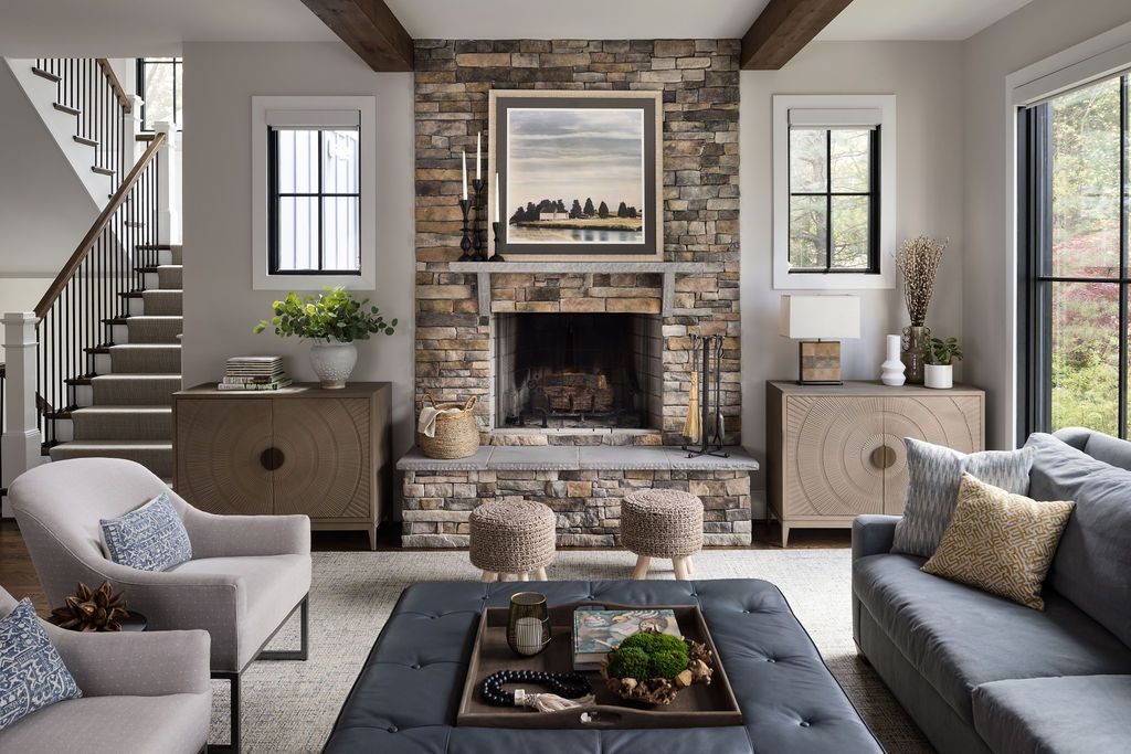
A paint chip can look like the perfect soft beige in a store and turn strangely pink beside your sofa. Or a gray that seemed calm online becomes icy blue on the wall at breakfast. Living room paint undertones are often the reason. The visible color is only part of what you are choosing; the quieter warm, cool, green, violet, or pink cast becomes more obvious beside flooring, upholstery, trim, and changing daylight.
Before you buy a gallon, put the sample next to the things that are staying. A cream sectional, honey-oak floor, and stone fireplace each influence how the wall color reads. A shade that looks lovely against a blank white sample card may clash with a warm rug. You do not need a designer’s eye to notice the mismatch. You need larger samples, a few comparisons, and time to watch the room.
Start with the room you actually have
Look at the fixed finishes first: flooring, fireplace surround, cabinets, built-in shelves, and trim. Then consider the biggest furniture pieces you are keeping. Those surfaces will still be there after the paint dries. If your wood floor has a strong orange cast, a very cool gray wall can make the contrast feel sharper. That might be intentional, but it should be a choice rather than a surprise.
Place a clean white sheet of paper beside each finish to make its color bias easier to see. Does the stone read creamy or bluish? Does the upholstery lean toward yellow or pink? This is a comparison exercise, not a scientific test. The aim is to stop calling every light neutral ‘beige’ and start noticing why two nearly identical swatches behave differently in the same corner.
Why light changes everything
Morning sun, shaded afternoon light, and warm evening lamps can pull different qualities out of the same wall color. Sherwin-Williams’ guidance on paint undertones notes that window direction and artificial lighting influence how undertones appear. North-facing light can make a color feel cooler, while warmer light can soften it. That does not mean a north-facing room must be painted warm; it means the sample needs to be seen in that room.
Think about the living room at the time you use it most. A room where you read at night under warm lamps deserves an evening test. A family room used mainly on bright weekend mornings needs a daylight check. Take pictures if they help you compare, but remember that phone cameras and screens can shift color. Trust the dried physical sample under the actual light more than a filtered image.
The difference between warm and cool neutrals
Warm whites and beiges may carry yellow, peach, or pink notes. Cool grays and whites may lean blue, green, or violet. A greige can sit between them, but even a balanced-looking neutral has a bias beside another material. The goal is not to remove undertones. Every paint has a color identity. The goal is to choose one that works with your floor, furniture, and the mood you want.
A practical comparison: imagine a beige sofa with a subtle rosy cast and an oak floor with golden warmth. A wall sample with a green-gray undertone might make the sofa look pinker. A softer warm neutral may connect the two, though it could also make the room feel more golden. Put both samples near the sofa and the floor. The answer should emerge from the real relationship, not from the color’s marketing name.
Use a proper sample, not a tiny square
Paint a generous sample on a movable board or use a manufacturer-approved sample format. Give it the recommended drying time, then move it between the window wall, a shaded corner, and the area behind the sofa. Benjamin Moore’s color handbook recommends testing colors in the intended space and checking them at different times of day. A small chip held under a bright store light cannot show the full effect.
Compare no more than a handful of serious candidates at once. Ten pale neutrals scattered around the room can make every choice harder. Narrow the group by the dominant finishes, then test two or three finalists side by side with some space between them. Avoid painting one candidate directly over another without adequate coverage, because the underlying patch may distort what you see.
Check the trim and ceiling relationship
The wall color does not live alone. A creamy white wall beside stark blue-white trim can look yellower than it did on the sample card. A warm off-white ceiling can soften a muted wall color. Decide whether you want a clear contrast between trim and walls or a quieter, closely related palette. Both can work, but mismatched undertones are easier to notice when surfaces touch.
If you plan to repaint trim, test that color alongside the wall sample before buying either finish. If the trim stays, let it help narrow your wall choices. A simple board showing wall color, trim white, and one floor sample can prevent a weekend of repainting. For finish selection, our eggshell, satin, and semi-gloss comparison explains why sheen is a separate decision from hue.
Do not mistake sheen for undertone
Gloss and surface texture change how much light a wall reflects. A higher-sheen finish can emphasize highlights and surface flaws, while a flatter finish tends to diffuse reflections. Two paints mixed to the same named color may still look different when applied in different products or sheens. Test the actual paint line and finish you plan to use rather than assuming the sample pot will match every final coating.
Also remember that wall condition matters. Old stains, dark paint beneath a pale new color, and uneven primer can affect the first coat. Follow the product’s preparation and coverage directions. Judge the color after the intended number of coats has dried. It is frustrating to reject a promising neutral because the first thin coat lets the previous wall color show through.
The sofa, rug, and curtains are part of the palette
A patterned rug may contain several colors, but one or two usually dominate at room scale. Choose which you want the wall to support. If your rug has a blue-gray field and warm rust accents, you could lean into the cooler background or echo the warmth of the accents. Test both. The more permanent and expensive the rug or sofa, the more useful it is to make those pieces the starting point.
Curtains can alter the daylight reaching a sample. Sheer panels may soften glare; lined drapes can darken a corner when closed. Our living room curtain length guide addresses proportions, but fabric weight and color also affect how a finished room feels. If you are replacing window treatments soon, bring a fabric swatch into the paint decision instead of treating the window as an afterthought.
When a bold color is easier than a pale neutral
Deep green, navy, clay, or charcoal may feel like a risk, yet their direction can be easier to read than a nearly white paint that shifts from pink to gray. A strong color still has undertones and needs testing, especially beside wood and upholstery. The difference is that you are choosing a clear mood. In a room with good lighting and a few lighter furnishings, a deep wall can feel intentional rather than oppressive.
If the living room opens into a hallway or kitchen, look at the sightline from each space. The new color does not have to match adjoining walls, but abrupt temperature changes can feel accidental. Hold sample boards where the rooms meet. A connecting trim color or repeated textile hue may help them relate without painting the entire floor plan one shade.
Make the final decision on a normal day
Choose a day when the room looks as it usually does. Turn on the lamps you normally use, open the curtains to your typical position, and compare samples from the sofa rather than inches away. Live with the finalists for a few days if possible. Ask which color makes the existing furniture look its best and which one still feels good after sunset. That is a more useful question than which swatch won on social media.
Living room paint undertones stop feeling mysterious once you test colors against real finishes in real light. You may still prefer the unexpected contrast of a cool wall and warm floor. That is fine. The win is knowing how the choice behaves before the room is painted, so the finished space looks deliberate at breakfast, during movie night, and every ordinary hour between.
